
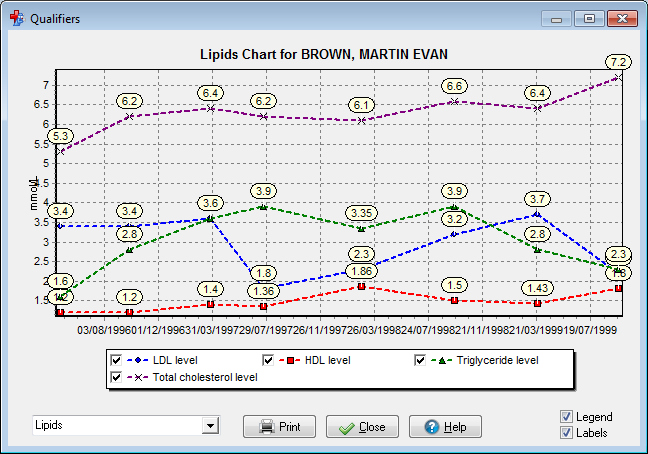
Qualifier Chart
Qualifier Charts can be used to plot numeric qualifier data for a patient.
Chart_Types define the sort of patient data that can be plotted together on a chart. Any number of chart types can be defined.
A dropdown list at the bottom of the chart allows the chart type to be selected. The list only displays the chart types for which there is patient data. For example, the Blood Pressure chart will not appear on the list if the patient has no Blood Pressure on record. If the patient has no data which corresponds to any chart then a message is displayed and the chart window does not open.
The legend (if displayed) will allow you to select which measures you wish to hide or show. Tick the boxes in the legend to display or uncheck to hide the particular measures.
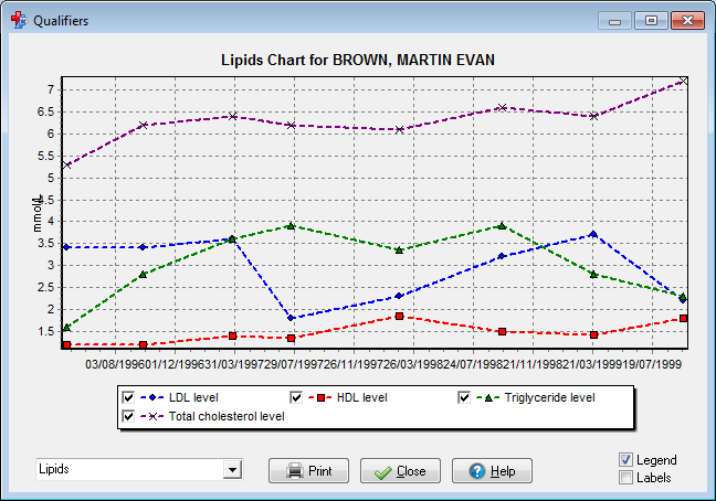
(Qualifier chart showing selectable legend).
Note: Values which appear as 'greater than' (\>) or 'less than' (\<) will appear with a different point marker. The legend will display to identify 'greater than' values as a upward pointing yellow triangle and 'less than' values as a downward pointing yellow triangle. (e.g. eGFR values \>90). If the values are 'greater than or equal to' (\>=) or 'less than or equal to' (\<=) the colour of the triangle will be changed to green.
(eGFR Example displaying '\>90' values).